Budget Flow Diagrams Live
- June 7, 2026
- by Wealth Meta Admin
Every wonder where you money is going? Well now you can see it visually in our budget tracking tool.
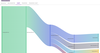
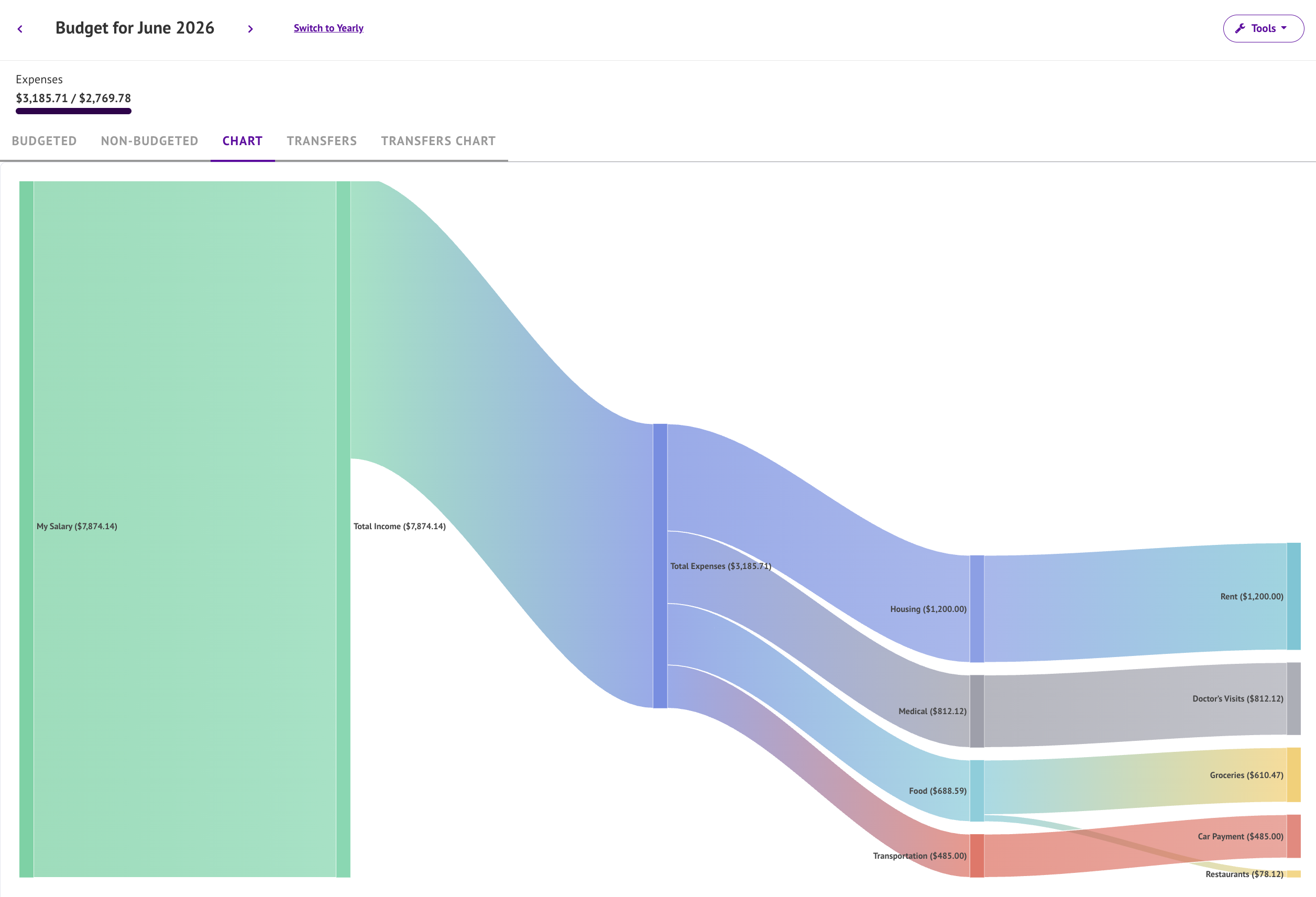
Sankey Charts are a type of flow diagram that displays relationships between items. The thickness of the bar is the relative weight of the flow. In the case of budgets the weight is measured in the number dollars earned or spent. So thick income bars are good, and skinny expense bars are better!
In this case the chart starts with your income which flows through to expenses by group. The expense groups then filter down to the categories. If you are tracking savings, a section will appear for that as well. The more detailed your budget tracking and categories are the better the chart will look!
Since not all expenses can be categories, non-budgeted expenses get their own group along side your other main categories.
Release notes:
1.4.0 June 6th, 2026
- Budget Screen gets flow diagrams (Sankey charts) for budgeted categories (Chart tab), and transfers (Transfers Chart tab).